Honeywell Alert case study
Research
As part of the Honeywell User experience team, we aim to create an Alert system design with three main objectives
- User Interruption moving user focus form a task to a notification
- Reaction speed up the response of the user to a specific alert
- Comprehension providing structured information to the user

With these objectives in place, we started the practice of double diamond as a standard way of UX design and I am going to cover the steps in this article
In this phase, we gathered insights into the different aspects of an alert system that can help us accomplish our key objectives. It includes research on existing alert components, appropriate usage and best practices for designing alert and notification system, and competitor analysis.
Concept Designs
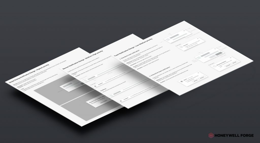
Based on the insights gathered in the research phase, we defined a few alert categories and this becomes the foundation of our design concepts. I was to create a design alternative based on those categories
Usability evaluation
Having a different variation of wireframes created as part of concept designs step, we were to bring some users to evaluate the usability of the design for most of the possible scenarios. The feedback from potential users assisted to finalize the first iteration of the alert system design

Interactive mockup
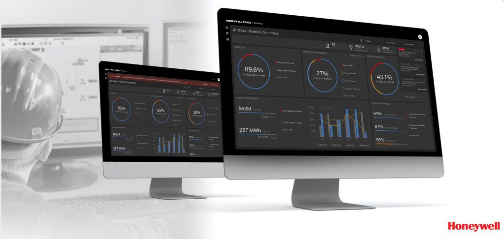
At this step, with having all scenarios defined in the previous steps, the interactive mockup showcasing the behaviour of the system were generated using Sketch and Invision. Since we needed to clarify specific behaviour in clients, I showcased the actual component writing reactJS modules.
It seems we can not find what you are looking for. Perhaps searching can help.
